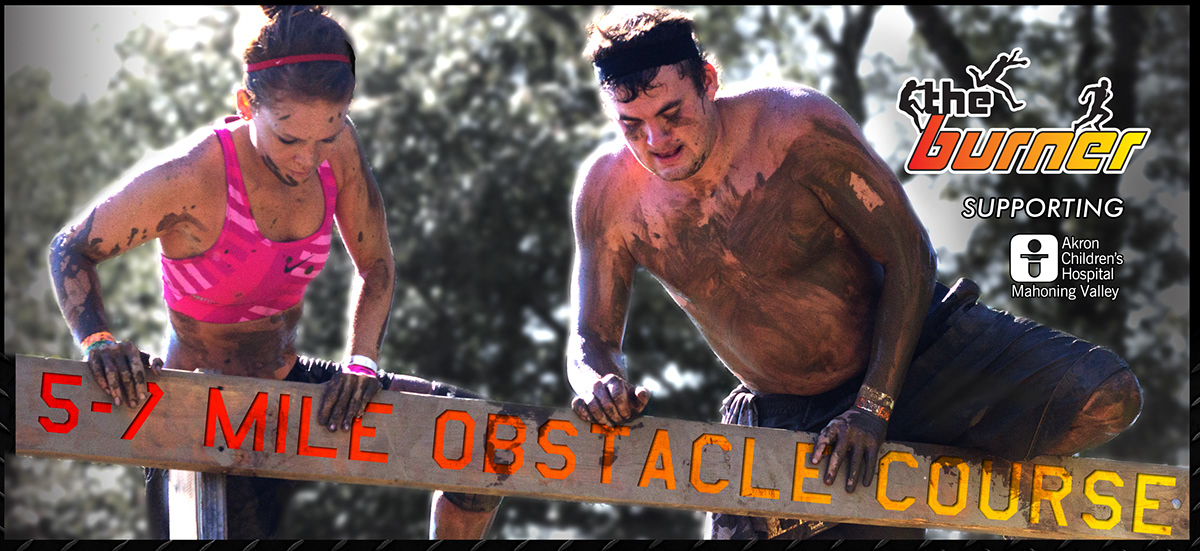
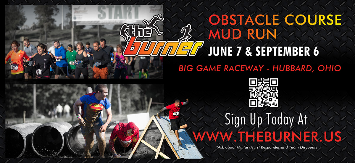
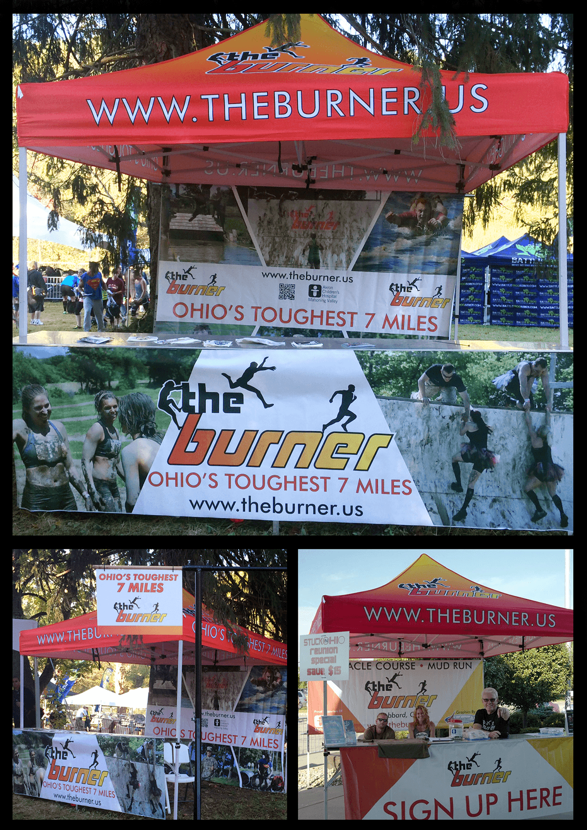
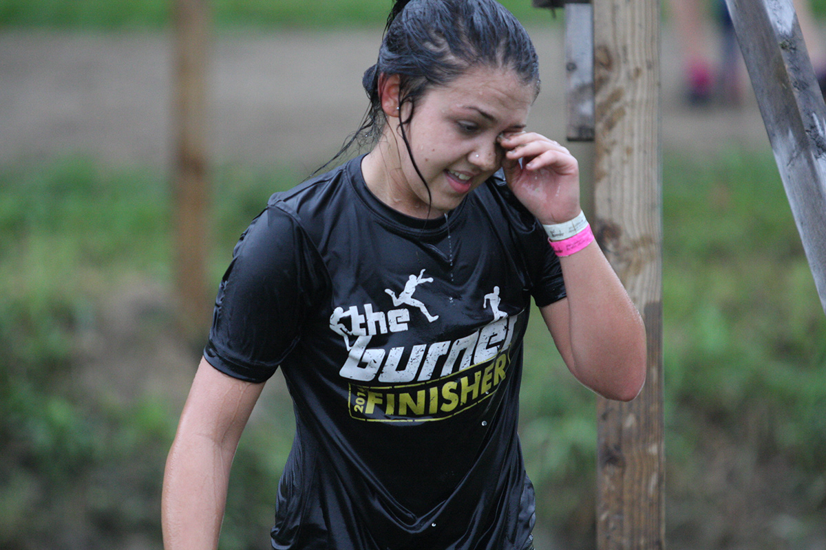
We began the 2014 event planning still using a military based font for our event flyer. Since then we have solidified a more consistent direction based on the Futura family, with Futura Medium as our design base that has allowed us a build a great visual impression across multiple mediums.
Shown are the 2014 showcard, newly created booth display and the 2014 finisher shirt. This direction also carries over to dozens of social media posts combining our text and graphics with some of the fantastic photography we've collected across 3 events to date and multiple digital and print signs and banners.
I feel the geometric san-serif is a great pairing with the existing logo and details such as the sharp angles in the medium weight of Futura call back to the obstacles that runners often have to scale at these runs.